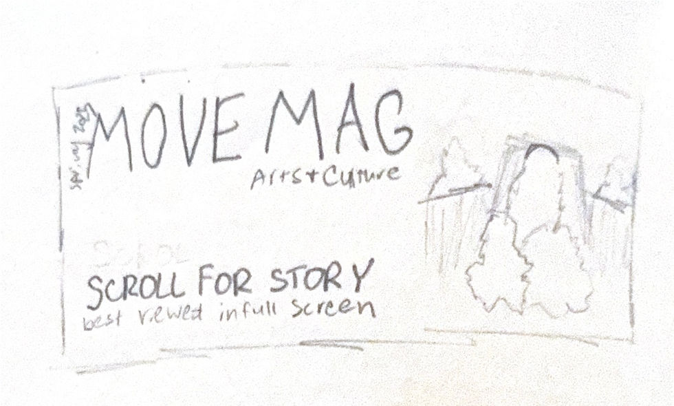
MOVE Mag.
layout design • typography • art direction • print production
THE PROJECT
During my time as Assistant Graphics Editor for The Maneater, I stepped into the position of Associate Art Director for the 2024–25 edition of MOVE Magazine-- our annual arts & culture magazine, published during each spring semester. I worked closely with editors, writers and photographers to turn ideas and stories into visually engaging layouts.

%20(1)%20copy%202%20Large.png)
Concept & Theming
The process began with concept development alongside the Graphics Editor/ Art Director and my fellow Associate Art Director. Together, we established the creative foundation for the entire issue. After receiving the theme, "A Miz-aic", we built a shared moodboard to explore textures, fonts and colors. Then, we refined it into a unified theme for the magazine. From there, I helped create the specific color palette, type hierarchy and overall graphic system that would guide every spread.
%20(1)%20Large.png)
%20(1)%20copy%20Large.png)
Meeting with Writers
Once the theme was in place, I met individually with my assigned article authors to understand each story’s nuances to determine layout ideas and potential visual opportunities. These conversations shaped the layout concepts I proposed for each piece:
-
Some stories called for bold, full-bleed visuals
-
Others worked best with clean, minimalist typography
-
Feature stories often inspired more complex spreads with sidebars, pull quotes or custom graphic elements and would often include photoshoots
These early decisions ensured that every layout supported the tone and message of its story.


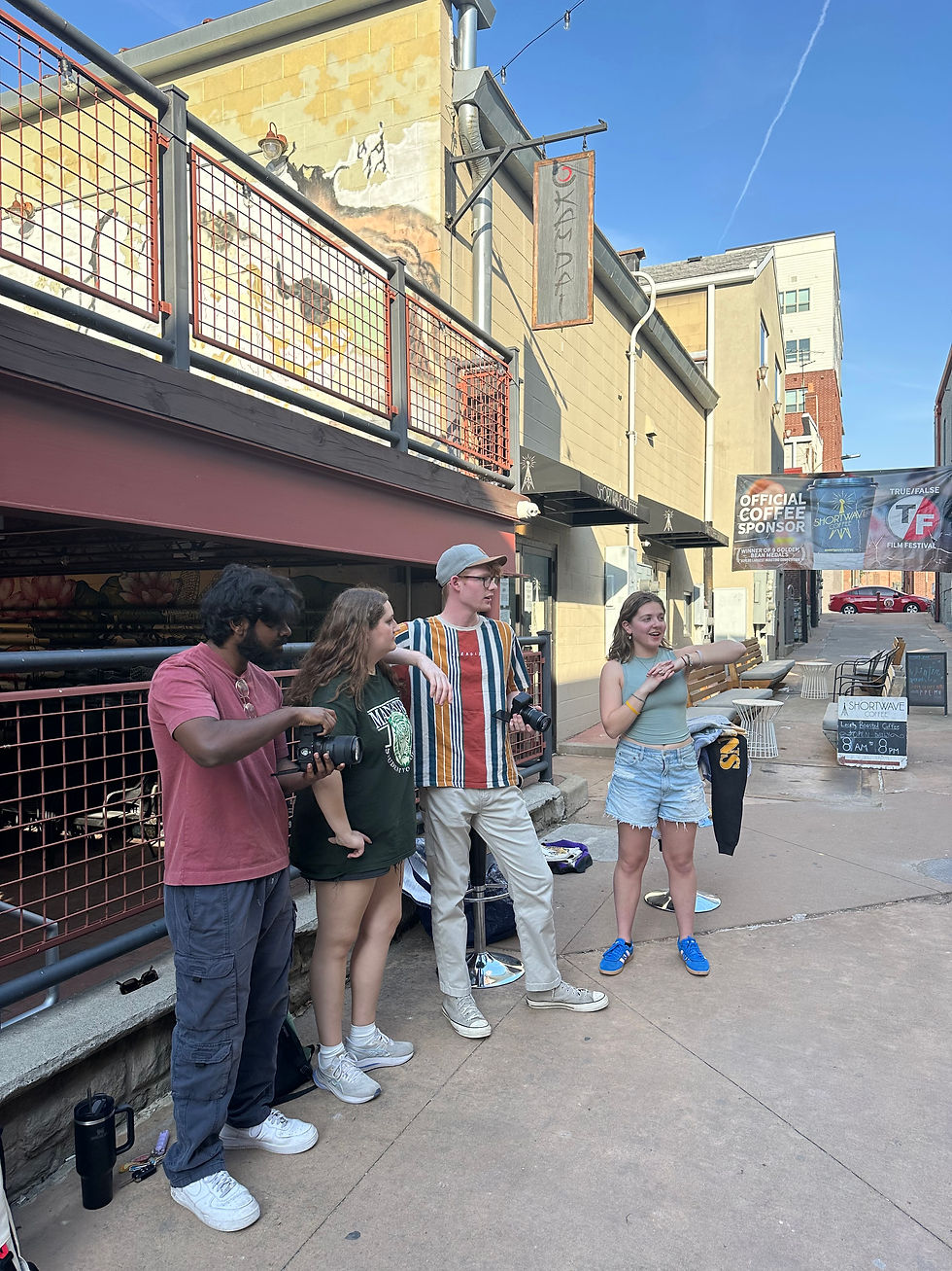
Directing Photography
After understanding each story, I communicated any photography needs to the Photography Editors. I provided direction on:
-
Shot types and orientations
-
Whether photos needed negative space for text
-
Mood, props, or lighting references
-
Any special requests for spreads or cover elements
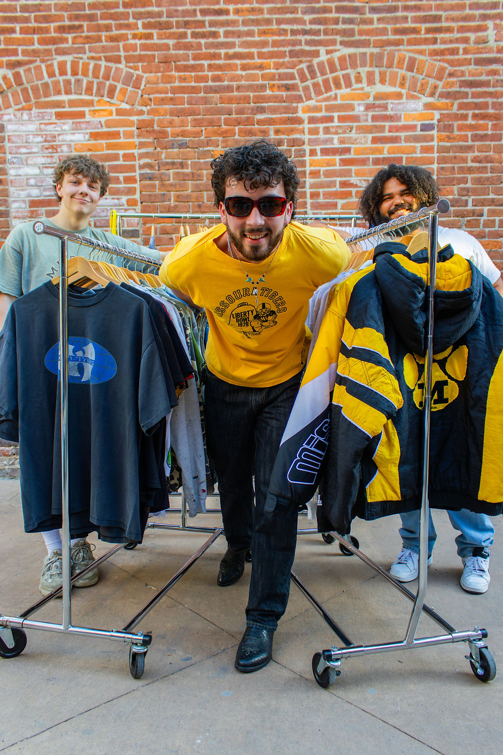
Sometimes, in the cases of our larger shoots, such as vintage sellers, lotus dress and letter from the director layouts, I would serve as photoshoot director and photographer.
Once images were delivered, I reviewed our selects, proposed crops and coordinated with photographers to make sure the photos were edited to aligned with the established theme.
Building the Layouts
With a copy draft and primary photography in place, I moved into building the spreads. Working in InDesign, I used our predetermined styles to start as a building block for my designs. I focused on allowing each spread balance imagery, typography and negative space to create a dynamic reading experience. When needed, I developed custom design elements such as illustrated accents, photo treatments or special typographic touches to elevate the storytelling.

A spread cut from print and original draft of Bands of Columbia spread before it was changed to Q&A style


Copy Integration & Editorial Review
Once copy was finalized, I added the text into the layouts and began the copyfit stage. I adjusted spacing, fixed widows and orphans and ensured everything read cleanly. I then worked closely with the Editor-in-Chief, Managing Editor, Mag Director and Art Director to refine each layout. This included:
-
Adjusting image placement
-
Shifting typography for clarity or hierarchy
-
Modifying design elements based on editorial needs
-
Rebalancing spreads for stronger pacing
We went through several rounds of review, with each pass tightening the design until it was polished and publication-ready.
After one last review with leadership, myself and the Art Director submitted the final files to print, ensuring MOVE Magazine was delivered clean, consistent and beautifully aligned with our editorial vision.
The Final Product
The completed MOVE Mag brought our full visual concept to life across dozens of pages. I designed several key components of the issue, including the:
-
Full front and back covers
-
Table of contents
-
“Bands of Columbia” spread
-
Joey Yancey feature page
-
“Sentimental Recipes” page
-
As well as drafting and refining many other pages
Each piece reflects the theme we developed at the start of the process and showcases the balance between storytelling and visual cohesion that shaped the entire magazine.
Once finished, we printed and distributed thousands of copies across the University of Missouri campus and Columbia. Seeing students pick up the issue, and watching it circulate around the community was a rewarding culmination of months of design, collaboration and refinement.