EOS Show Choir.
Color systems • typography • layout design • Photography
THE PROJECT
I designed full vinyl packages and lyric booklets for EOS Show Choir's four productions, translating each show’s story, era and aesthetic into a cohesive experience. Through color scheming, thematic research and show-inspired visuals, each booklet becomes a extension of the show’s narrative and identity.
The Process
Over the past year, I created full vinyl concepts and accompanying lyric booklets for Waukee Northwest EOS Show Choir’s past four shows, each with their own distinct visual world. My process always begins the same way: I re-watch the full performance and revisit the lyrics, pulling out themes, emotional beats, and visual motifs. From there, I analyze the show’s existing lighting palettes, costuming choices and scenic elements to build a cohesive visual system the booklet can live within.


Once I have some thematic anchors for the show, I start assembling assets: production photography (by myself for "The Unbroken Circle" and "Yes Chef!"), textures and other elements tied to the show’s narrative. The vinyl covers are designed to feel like standalone artifacts, while the interior booklets function as immersive extensions of the performance—pairing lyrics with specific imagery, original illustrations and layout systems that match each show’s aesthetic identity.
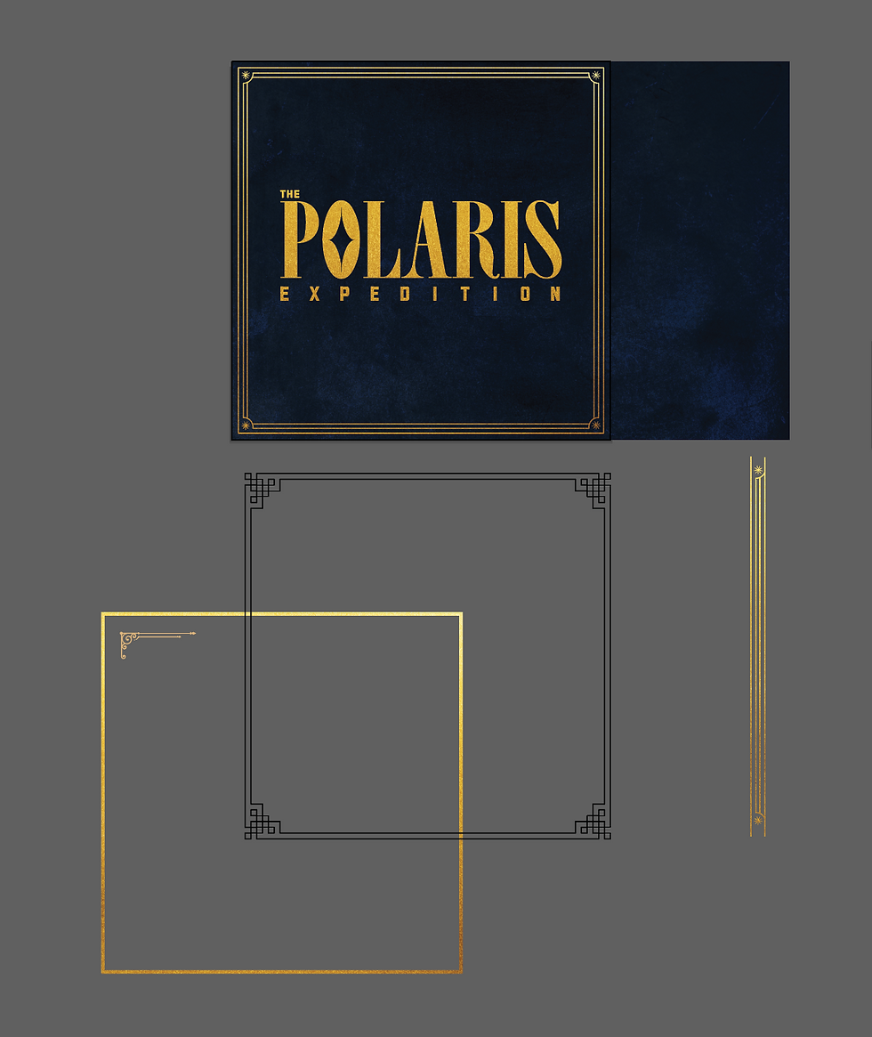
The Polaris Expedition (2022)
The Polaris Expedition marked EOS’s very first show as the newly-formed Waukee Northwest varsity show choir. The group set sail toward becoming one of the top show choirs in the state of Iowa and the nation. I grounded the design in deep navy to echo the night-sky setting of the “expedition,” with gold accents symbolizing navigation, discovery and the guiding-star of a group finding thier own direction. The visuals reflect both the show’s theme and the ensemble’s own journey: bold, ambitious and ready to chart new territory.


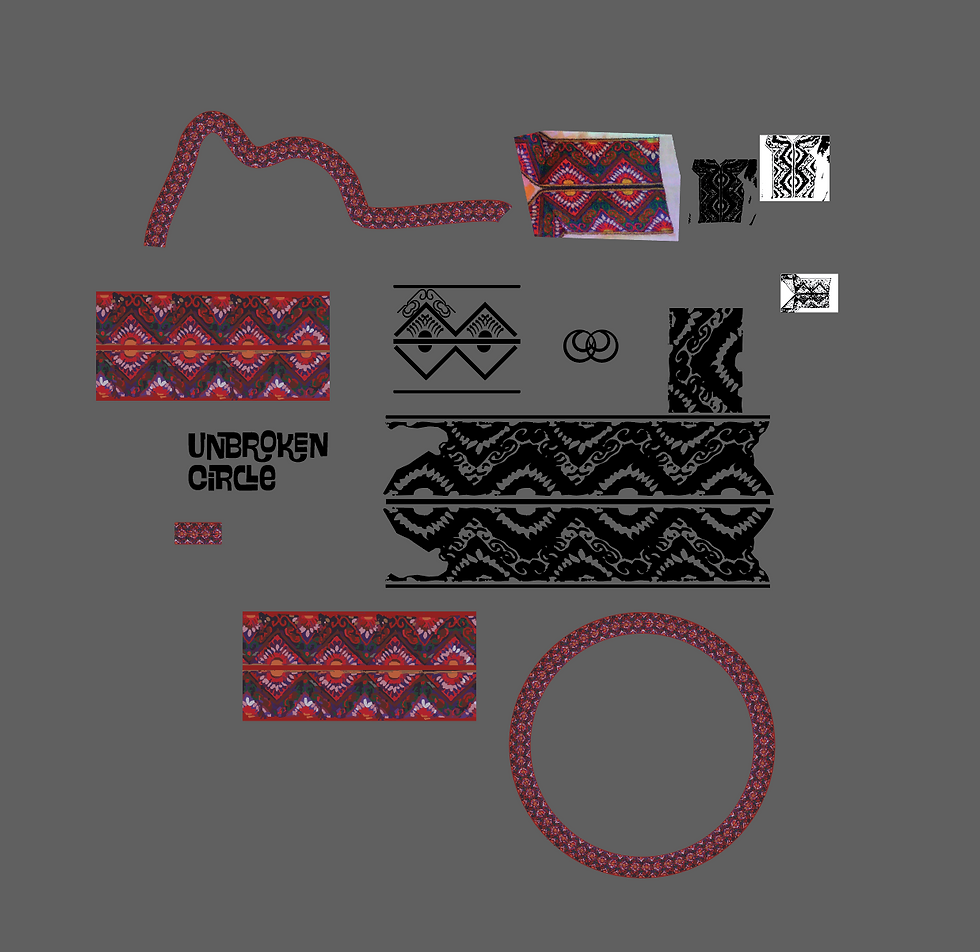
The Unbroken Circle (2023)
This booklet’s palette and patterns are pulled straight from the production itself. One of my favorite features is the ribbon pattern I pulled directly from the costume edging. These embroidered motifs and lighting color scheme became the visual foundation of this design. The result is a product that echoes the show’s themes of community and tradition. This design also features some of my first-ever performing arts photos.
Pale Blue Dot (2024)
This was the first of the vinyls I created, as it was the one year I was in the choir myself. Because the show was set in a '70s college lecture hall, this design leans into era-specific artifacts. I featured transparencies I designed to be props in the show, Polaroids and retro textures. I pulled visual cues directly from the show’s storytelling and blended them with the nostalgic feel of the decade to create a cohesive, time-rooted aesthetic.


Yes Chef! (2025)
This vinyl set was inspired by the show's high-energy depiction of a working in a Michelin Star kitchen. This concept mixes recipe typography, newsprint layouts and culinary textures with visual cues from The Bear. The design embraces the show’s fast-paced, slightly unhinged energy and features some of my photos from early in the season.