The Maneater.
Branding • visual identity • typography • color systems
THE PROJECT
As Joint-Visuals Director for The Maneater (the University of Missouri’s student newspaper), I led a full visual identity redesign to create a unified, flexible brand.
When I started, the publication was using several different logos, multiple shades of green, and a mix of typefaces with no clear hierarchy. My goal was to build a brand that finally felt consistent, recognizable, and reflective of a modern student newsroom.
What I Started With
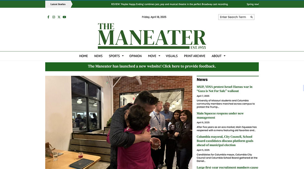
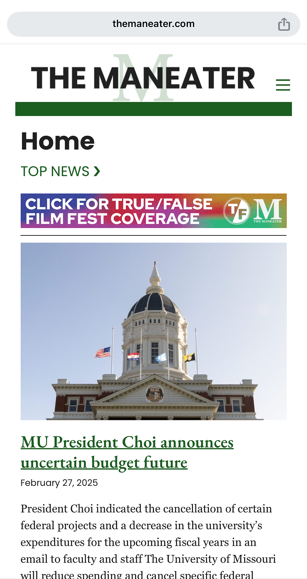
Before the redesign, The Maneater’s visual identity lived in every direction at once.
Across print, web, and social media:
-
no single logo was used consistently
-
type choices changed from platform to platform, even across the same platform
-
colors shifted depending on who made the graphic
-
there were no lockups, no guidelines, no clear voice
This made the newspaper feel less cohesive than the quality of its journalism deserved.


Logo Conceptualizing
I kicked off the redesign by looking at other college newspaper logos to see what I liked and began experimenting with wordmarks that balanced the paper's 70+ years of history and a modern approachability.
I tried:
-
Different placements and scales of “the”
-
Serif vs. sans-serif options
-
Weight contrast explorations
-
Including the tagline "The Student Voice of MU"
These early sketches helped narrow down what options felt authentic to The Maneater.
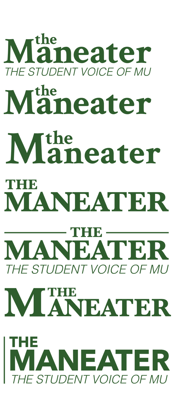

Logo Refinement
From the initial sketches, I built three polished logo options to present to the Editor-in-Chief, Managing Editor and Director of Marketing & Strategy.
These options focused on:
-
improved readability
-
clean hierarchy and optical balance
-
flexibility to develop print mastheads and social icons
-
a more modern interpretation of a newspaper wordmark
From this presentation, our team landed on logo option 2, and I began to develop the rest of the brand and secondary logos.
Developing Secondary Logo Options
Once the primary logo was chosen, I expanded it into a complete system:
-
Horizontal and vertical lockups
-
Tagline and no-tagline versions
-
A simplified secondary logo
-
An “M” emblem for specialty and small use
-
Updating the tagline to follow new style guidelines
This ensured the brand worked everywhere-- from the front page to an Instagram post.


Color Palette Development
My next task was to solidify a color palette for the brand. My first color palette draft introduced Maneater Green as the core brand color, supported by a mix of of secondary brand colors. This version explored how far the brand could stretch while still feeling cohesive.
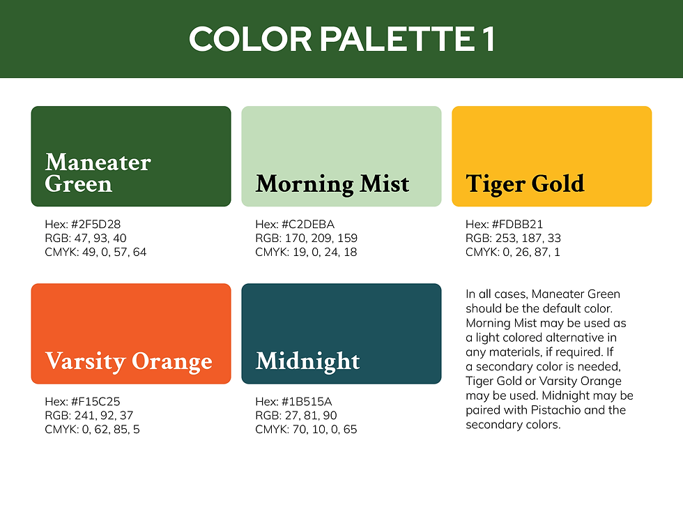
After discussing the first palette with our executive team and testing it across mockups and brand designs, I refined the palette, adding a lighter cream option, and assigned distinct colors for each section.

Typography
Our type system was built to feel like a modern newspaper: strong serif headlines paired with a clean, flexible sans serif body text.
I drafted several combinations before landing on a system that was:
-
readable at every size
-
compatible with the print workflows
-
distinctive enough to stand out on crowded social feeds
-
flexible enough for storytelling, templates, and infographics


Application is no longer available.
The Brand Guide
This brand kit represents the full evolution of The Maneater’s new identity. It brings clarity to daily design workflows while giving the newspaper a visual voice that feels confident, modern, and unmistakably student-led. The brand kit will allow students designing brand materials to fully understand The Maneater far into the future. I am excited to share the branding section of the guide and look forward to finishing the voice and sub-branding sections in the next semester!